Enhancing Swisscom myCloud
Project Overview
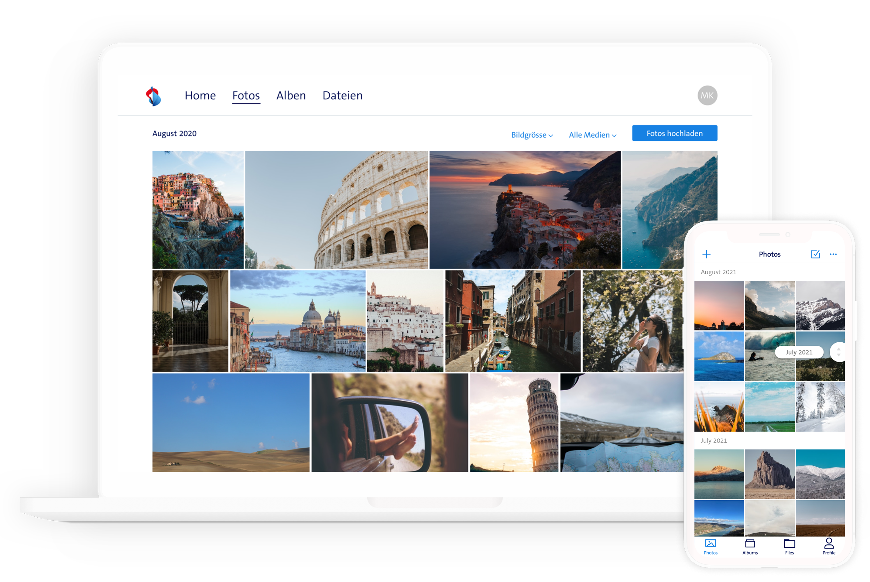
Product: Swisscom myCloud - A personal cloud storage service offered to Swisscom customers, providing photo/video backup, file storage, and access across Web, iOS, Android, and Swisscom Blue TV.
Challenge: To continuously evolve the myCloud platform by designing intuitive new features and improving existing ones across multiple touchpoints, ensuring a seamless and valuable user experience while aligning with business goals and technical constraints.
My Role: As a Product Designer, I drove the end-to-end design process for key features and improvements. My responsibilities spanned user research, ideation, wireframing, prototyping, high-fidelity design, usability testing, and design system management. I also played a key role in shaping product strategy by presenting explorations and advocating for user-centered solutions.
Approach & Process
Our team operated within an Agile (Scrum) framework, fostering close collaboration between Product Design, Product Management, Product Ownership, Customer Support, and Engineering.
Collaboration & Prioritization:
- We worked cross-functionally to identify user needs and business opportunities.
- Feature prioritization was guided by the RICE (Reach, Impact, Confidence, Effort) method, ensuring we focused on impactful initiatives.
- Regular PI (Program Increment) planning involved balancing near-term feature implementation, concept finalization, and exploratory work to de-risk future epics and understand technical feasibility.
User-Centered Design Process: Our design philosophy placed the user at the center of every decision.
- Research & Discovery: We employed various methods to deeply understand user behaviours, needs, and pain points. This included analyzing customer feedback, conducting surveys, and performing both moderated and unmoderated usability tests.
- Ideation: Based on research insights, we focused on defining the core user problems. We facilitated collaborative ideation using methods like Design Sprints, Brainwriting, or Crazy 8s to generate a wide range of potential solutions.
- Prototyping: Promising ideas were translated into interactive prototypes (initially low-fidelity, progressing to high-fidelity) to visualize the user flow and test core concepts.
- Testing & Iteration: Prototypes were rigorously tested with users. Depending on the feature's scope and maturity, we conducted remote unmoderated tests (using Maze) or moderated in-person sessions (pre-COVID, typically with 5 participants). Findings directly informed design iterations.
Design System Foundation: Recognizing the need for consistency and efficiency, I led the migration of the existing design library from Sketch to Figma. I established and maintained a robust component library and design system, ensuring consistency across platforms and streamlining the design-to-development workflow.
Feature Deep Dive 1: Rethinking Photo Synchronization
The Problem: The automatic photo backup, while convenient, often uploaded unwanted images (e.g., screenshots, WhatsApp media). Users deleting these photos locally found they remained in myCloud, requiring duplicate effort to manage their library. Conversely, some users relied on myCloud as primary storage, intentionally deleting local copies to free up device space. This created conflicting user needs around synchronization behaviour.
Exploration & Iteration:
- Concept 1 (Notification-Based): An initial idea involved notifying users about photos deleted locally but still present in myCloud, allowing them to choose which to keep or delete. Challenge: We realised this approach would likely trigger frequent, disruptive notifications, negatively impacting the user experience.
- Concept 2 (Setting-Based): We pivoted to making synchronization a configurable setting. To ensure discoverability, we designed a flow involving a one-time notification introducing the new option.
- Testing Round 1: We conducted an unmoderated remote usability test using Maze (due to the pandemic) to validate the concept and refine wording.
- Iteration: Based on test results, we made adjustments to the flow and UI copy.
- Testing Round 2: A second unmoderation test was performed to confirm the changes effectively addressed usability concerns and to gain further confidence.
Outcome & Reflection: This iterative, user-centered process led to a solution that empowers users to choose the synchronization behaviour that best suits their needs, reducing unwanted clutter for some and preserving storage space for others. The close collaboration ensured alignment across disciplines. While successful, future iterations could explore integrating this setting into the user onboarding flow for earlier awareness.
Feature Deep Dive 2: Designing a Secure Sharing Experience
The Trigger: A security audit highlighted risks associated with the existing sharing mechanism, elevating the priority of this Epic.
The Problem: Sharing files or photos generated unprotected links accessible to anyone who obtained the URL, posing a privacy risk. Furthermore, user feedback indicated a growing demand for password-protected sharing options. An additional usability issue was that links were generated immediately upon clicking "share," even if the user abandoned the process, leaving potentially sensitive data accessible unintentionally.
Exploration & Design:
- Ideation: We explored concepts including sharing via email address, password protection, and time-limited links to enhance security and control.
- Stakeholder Decision: The initial concept of direct email-based sharing was not pursued following stakeholder review.
- The New Flow: We redesigned the sharing dialog to require an explicit Call to Action (e.g., "Create Link") before a shareable link was generated. This prevented accidental sharing. We incorporated settings for password protection and link expiry.
- Testing: We validated the revised flow and new settings through moderated usability testing with 5 users, confirming comprehension and ease of use.
Outcome & Reflection: The redesigned sharing flow significantly improved security and addressed key user requests. It provided users with more granular control over their shared content. Reflecting on the process, dedicating more time upfront to user research specifically around sharing methods could have provided stronger data to potentially advocate for the email-sharing concept with stakeholders.
Additional Contributions & Enhancements
Beyond major features, I contributed to the continuous improvement of the myCloud experience:
- Dark Mode Implementation: Architected the color system rework for the Web client to facilitate Dark Mode development, and subsequently applied the theme to the iOS application, offering users their preferred visual scheme.
- Improved Photo Browse (Grouping & Filters): Redesigned the controls for grouping photos (by date) and adjusting thumbnail size. Previously hidden behind a pinch gesture and inextricably linked, these controls were grouped logically with filters along the photo timeline for better discoverability and independent control.
- Settings Redesign (Web): Overhauled the web settings section using an accordion pattern to reduce cognitive load and improve information hierarchy, making it easier for users to locate specific settings. This involved improving UX first, followed by visual refinement.
- Dynamic Homescreen Concept (Web): Proposed and conceptualized a dynamic, component-based Homescreen to replace the static version. This aimed to provide users with quicker access to relevant content and allow the product team to easily add or remove promotional or contextual components.
- Enhanced Search Concept: Visualized a redesigned search interface, particularly the empty state, to address user requests for more specific image content search. The concept included prompts and suggestions to guide users and showcase search capabilities.

Key Takeaways
Working on Swisscom myCloud provided valuable experience in designing for a large user base across multiple platforms within an agile environment. Key learnings include:
- The power of iterative design: Testing early and often, even with simple prototypes, is crucial for validating concepts and refining solutions.
- Collaboration is key: Close partnership with PMs, POs, Engineers, and Support ensures feasibility, alignment, and a holistic understanding of user needs.
- Balancing user needs and business goals: Effectively communicating design rationale and user research findings is vital for navigating stakeholder discussions and technical constraints.
- Design Systems drive efficiency: A well-maintained design system is essential for consistency and speed in a multi-platform product.