About the project:
Swisscom myCloud is a cloud service from Swisscom for their customers. It gives their cutomers the opportunity to backup their photos, save documents and access them from the Website, iOS and Android App, and from their TV.
In my role as a product designer I was responsible for creating new features and improving existing ones form research, wireframes to hi-fi designs. In addition I frequently presented new explorations and ideas to give advise for the product's strategy.
Product development process:
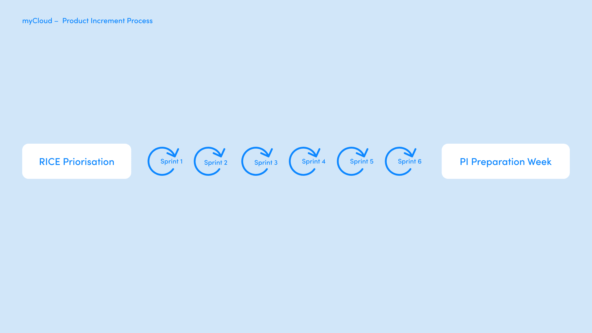
When I was working on new features I was working in close collaboration with product managers, product owners, customer support and developers. Together we're working on new ways to improve our cusomers experience. Since we were working in a agile (scrum) framework we're using the RICE (Reach, Impact, Confidence & Effort) method to priorritize our Epics.
During our PI's we have worked on Epics that were implemented soon and needed some last touches at the Hi-Fi Design, we finalized concepts, user flows and supported the developers when they had questions regarding the user experience. In addition we were doing explorations and have worked on Epics to gain more confidence and get a clearer understaning of technical feasibilities.
Design Process:
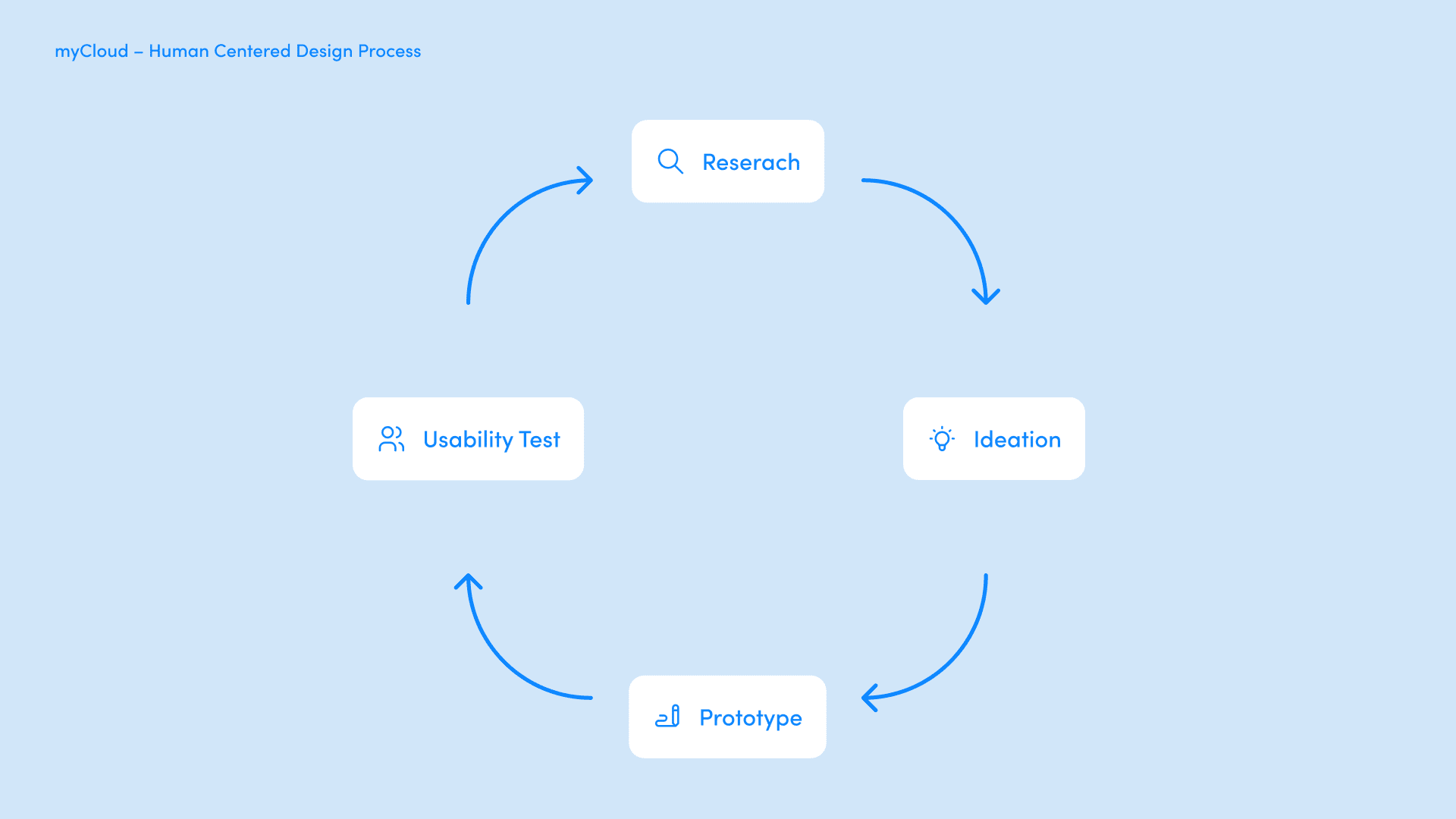
We've built our design Process around our customers.
Research: With various research methods we've tried to get a clearer understanding in where our Users struggle. We regularly did surveys, asked for customers opinions and feedback and we regularly had moderated and unmoderated usability testings.
Ideation: When the research was done we tried to focus on the Users problem. For Ideation we either did a Design Sprint workshops or smaller ideation sessions where we used creativity methods like brainwriting or crazy-8.
Prototyping: When we had an idea on what the actual problem of our User is and how we might solve it we started designing a prototype.
Usability Testing: The created prototype was then tested in a Usability Testing. Depending on the scope and maturity of the feature we did either unmoderated remote usability testings with Maze, or, pre covid, we recruited 5 people to join us at our office and test the prototype there.
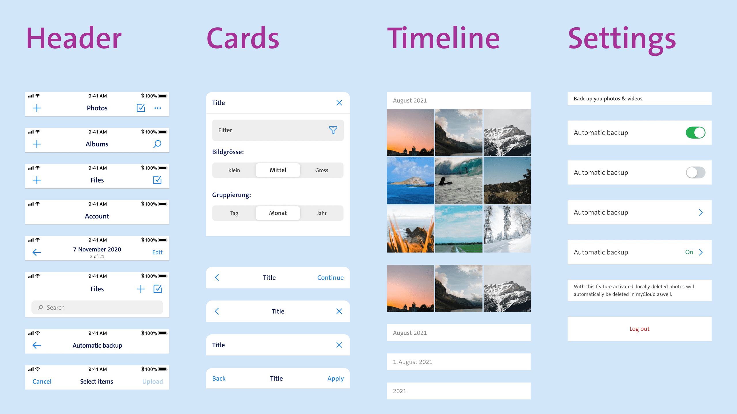
Design System
When I started working on myCloud I've moved the design from Sketch to Figma and built up a designs system and component library on Figma.
Synchronization
The problem
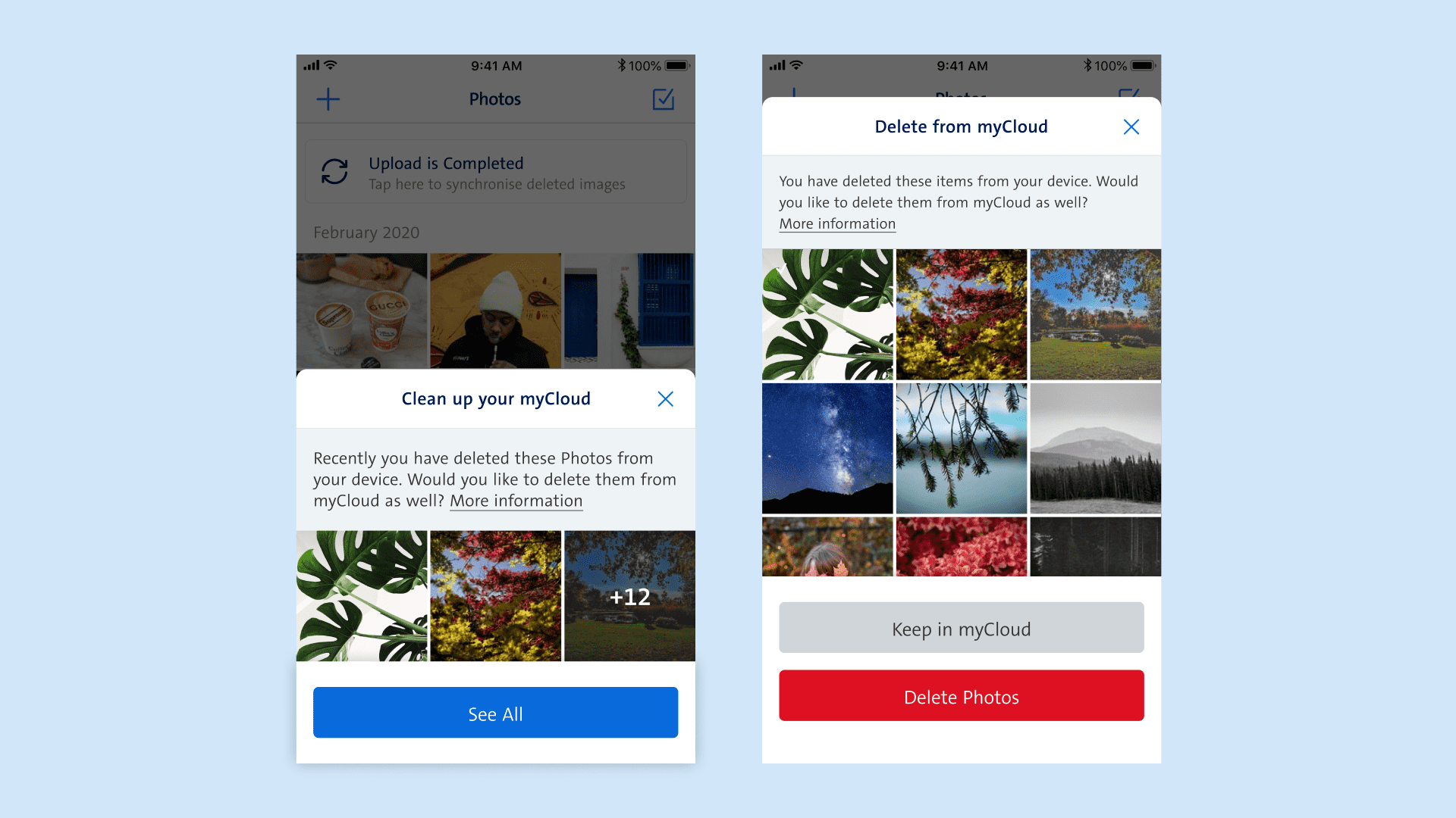
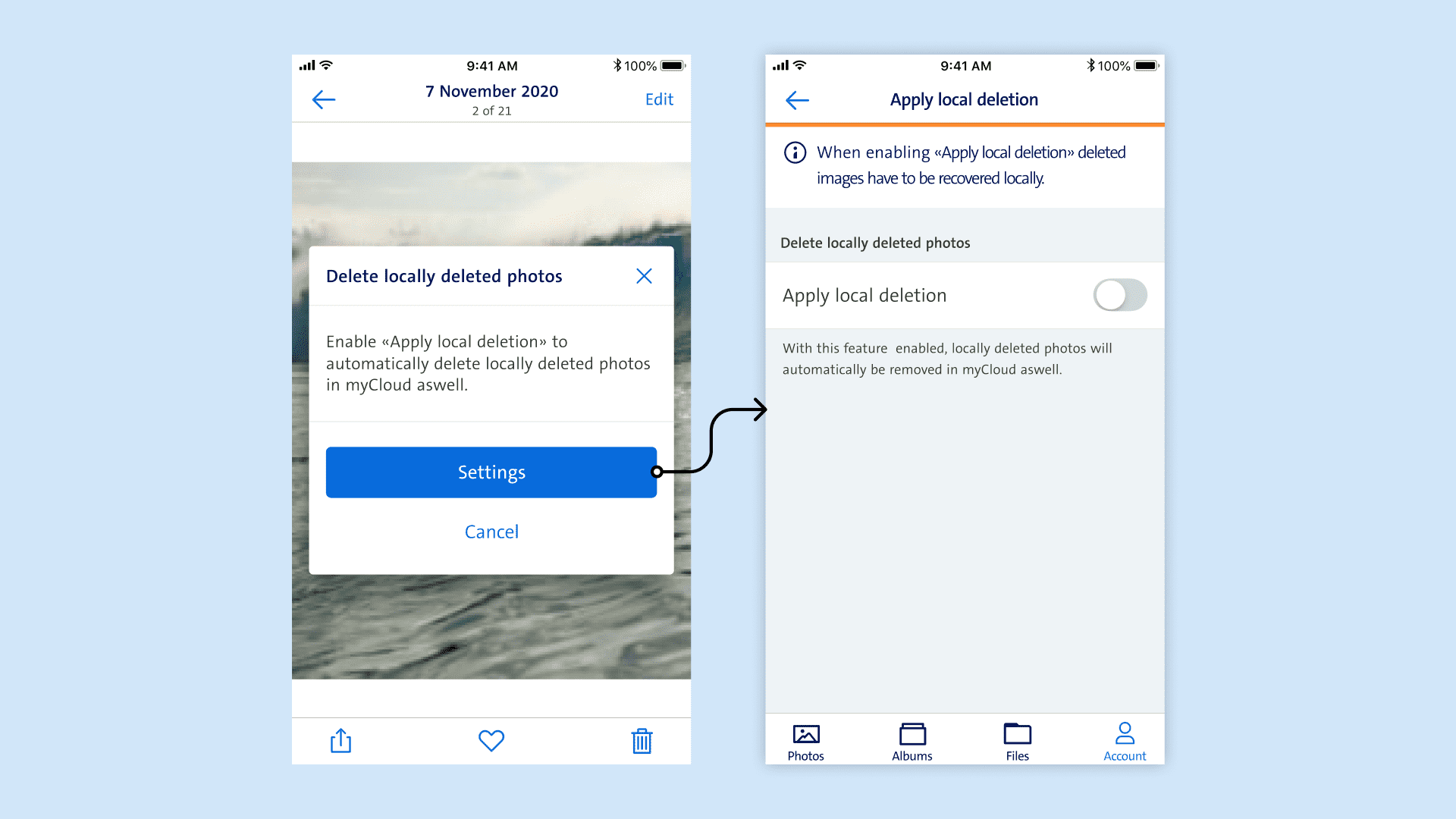
When our user's photos were automaticly backed up to myCloud there were a lot unwanted photos uploaded as well, photos that our users maybe got from a Whatsapp groupchat or an unwanted screenshot. Later on our users would delete those photos locally on their phone but still exist on myCloud. This caused the double amount of work from our users to only keep relevant pictures. On the other hand some Users need myCloud as external storage, so they upload pictures to myCloud and delete them on their phones so they can user their storage on the phone for other things.
First concept
In the first ideations we tried out a concept that informed the user about locally deleted photos that were still on myCloud. In this version we wanted to give the users the possibility to choose which photos they want to keep and which photos should be deleted.
We've then came to the realisation that the message would come to often and would be to prominent and distupt the user journey.
Second concept
In the second iteration we explored the possibility to make this feature available as a setting. To inform users about the possibility of turning this feature on we've created a flow that would trigger a notification to inform the user that this feature is available. To make sure our users get the concept of the feature as well as the choosen wordings we've created a first usability test. Since a global pandemic was happing during this time we've set up an unmoderated remote usability testing with Maze.co. After the first usability testing we've slightly adjusted the concept and made some smaller changes. To make sure we've not missed out on anything and to get some more insights since the usability testings were unmoderated and remote, we decided to run a second usability test for this feature.
Retro
In retrospective I think it was a great decision to take the time and really go through a user centered design process. The feature will minimize the users workload and provides a better user experience. Beacause of regular meetings where concepts, designs and usability testing outcomes were discussed the collaboration between developers, designers and product owner was really good. Despite this is a really good first step into the right direction, not all questions are answered yet. I would also like to integrate this feature in the User Onbording.
A new sharing experience:
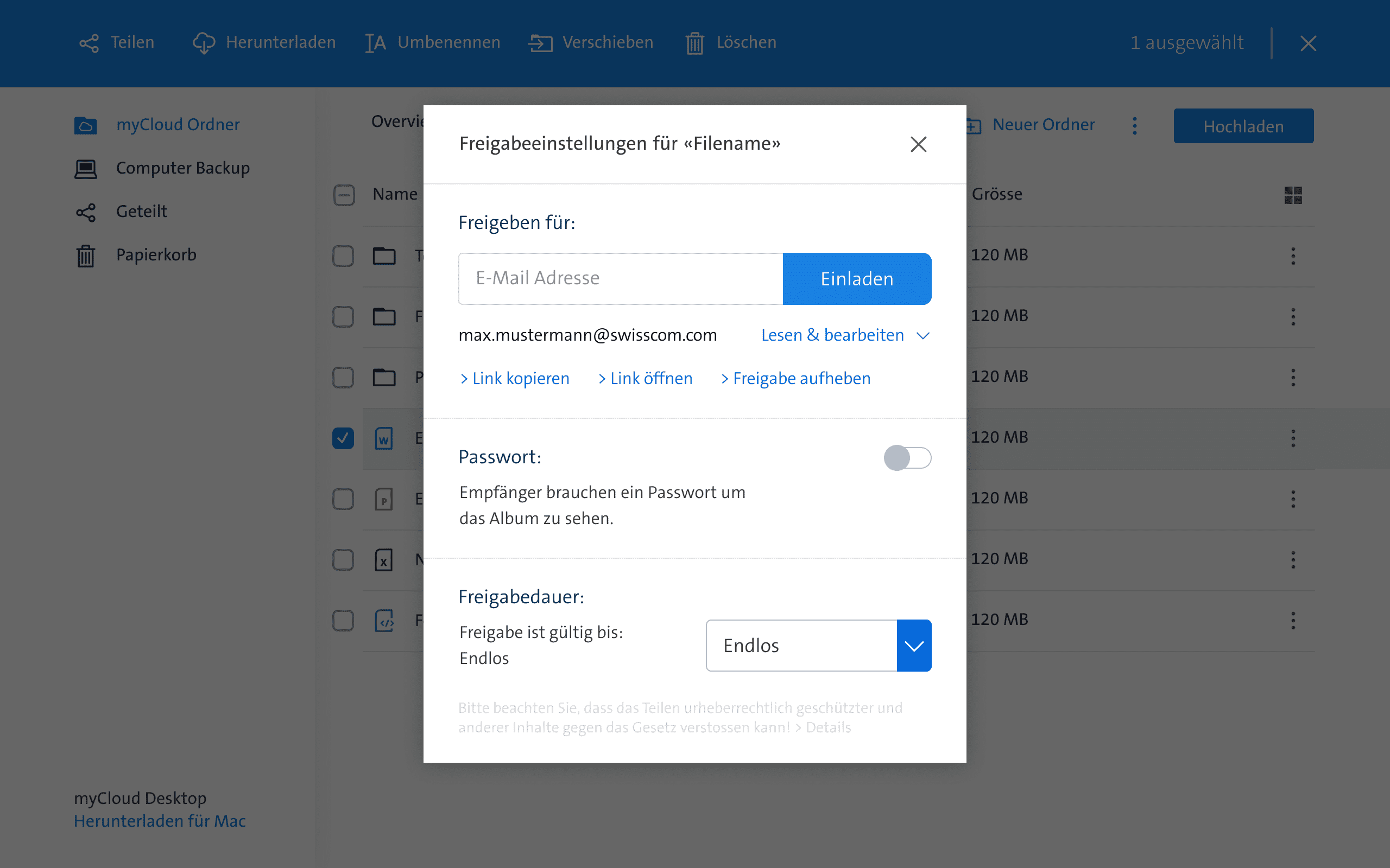
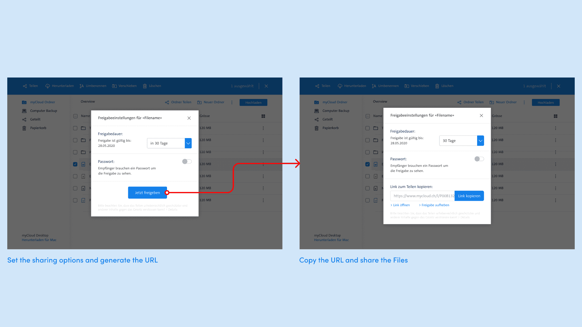
One of my first tasks at myCloud was redesigning the sharing experience. Due to a security audit the Epic quickly gained on priority. The problem was that when our Users decided to share files or photos it created an unprotected Link and everyone that had the link or who gets on the link by accident had access to the shared data. When we looked at recent customer surveys and feedback we saw a rise in a feature request for sharing password protected links. We took this as a chance to create a more secure sharing experience and give our customers even more possibilities on how they can share their data.
Stakeholder decision
In the ideation phase we explored the concept of sharing the data via the receivers e-mail adress. In addition to that the owner of shared folder could set a password for the folder and make it available for a limited time only. After it was presented to the Stakeholders the decision was to not go further with the concept of sharing via e-mail.
The new flow
Another problem we had with the existing version of sharing was that when a user clicked on «share» but then decided to not share the link with anyone, the data was still shared and could have found by accident. Because of that we decided to provide a «call to action» inside the sharing dialog. After we've tested this Version with 5 User's we had the confidence that our user's understand the new settings and wordings that help them to create a safer sharing experience.
Retro:
When looking back on the process and how we've designed this feature I'd have prefered spending more time working on the first version and getting some user research data and user feedback to give the stakeholders better reasons on why I think it would have been important to share via e-mail.
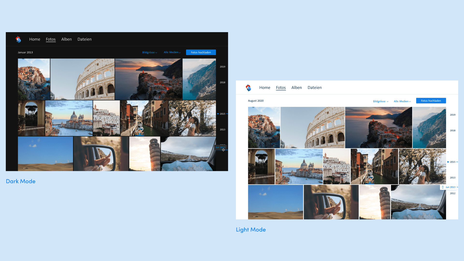
Dark Mode
I've reworked the colors of the Web-Client so that it was easier for the development to implement a dark mode on web. When the dark mode colorsheme was defined I've then also reworked the iOS App to provide our user their prefered colorsheme.
Grouping and Filters
When it came to change the grouping and size of the images in myCloud the feature was quite hidden behind a pinching gesture. In addition to this the Grouping did not work seperate from the size of the images. Since the grouping and image sizes were direcly related to the photos timeline, just like filters I grouped those features together.

Redesigning components
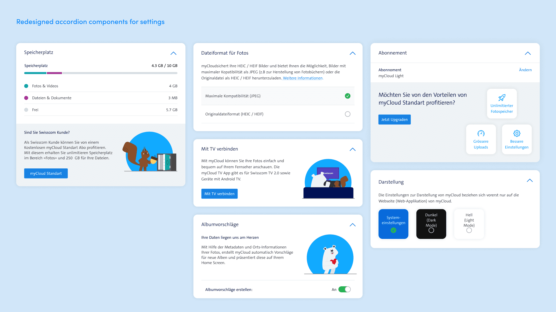
When I've redesigned the settings on web, my goal was to reduce the cognitive load and create a clearer hirarchy, so that it's easier for our users to find the setting they were looking for. To achive this I've decided to use the interaction pattern of an accordion.
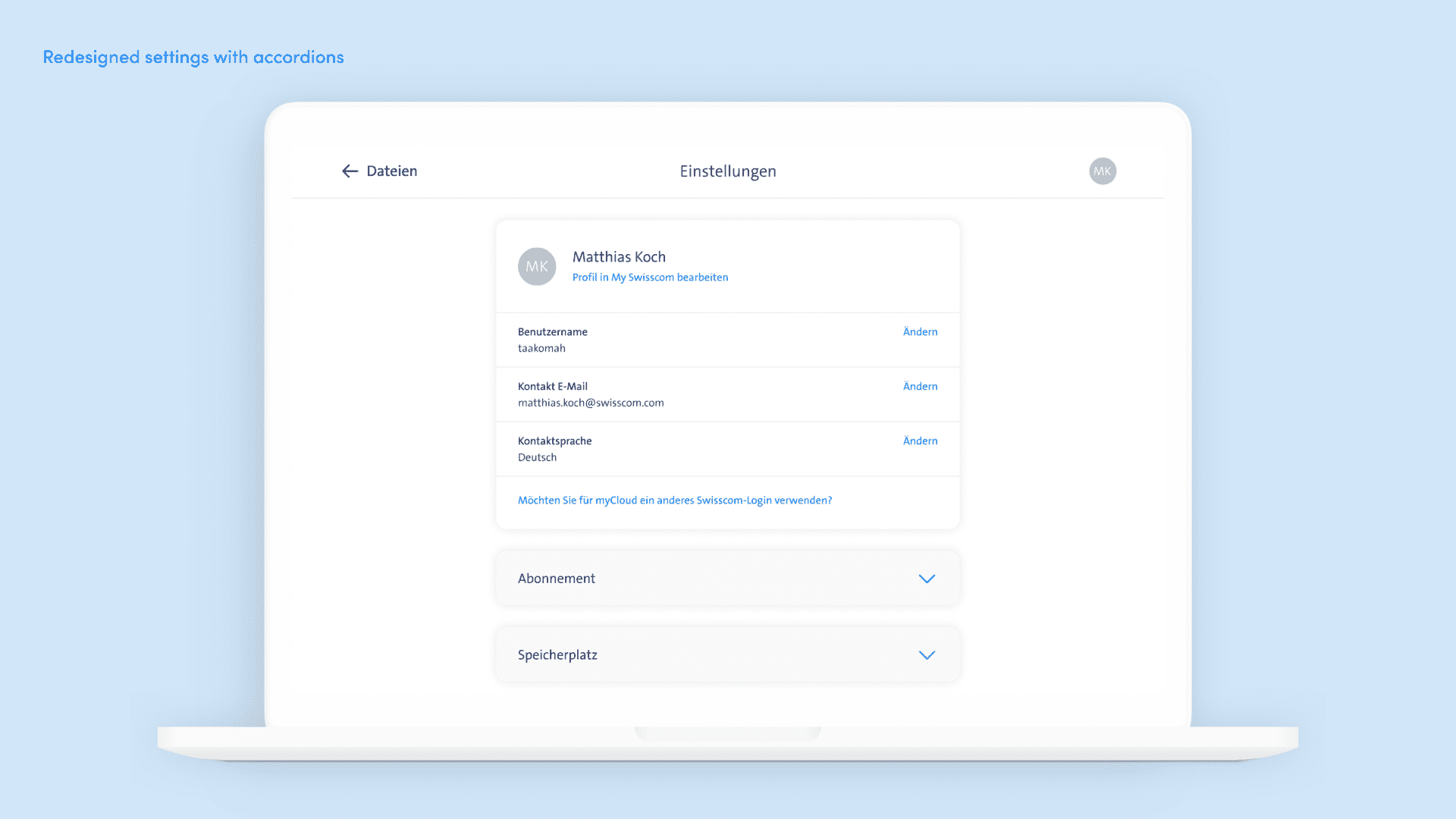
Since we were working in an agile enviroment and continously improving our product we focused on improving the user experience and when this was done we started improving the visual design by redesigning the componenets within the settings.
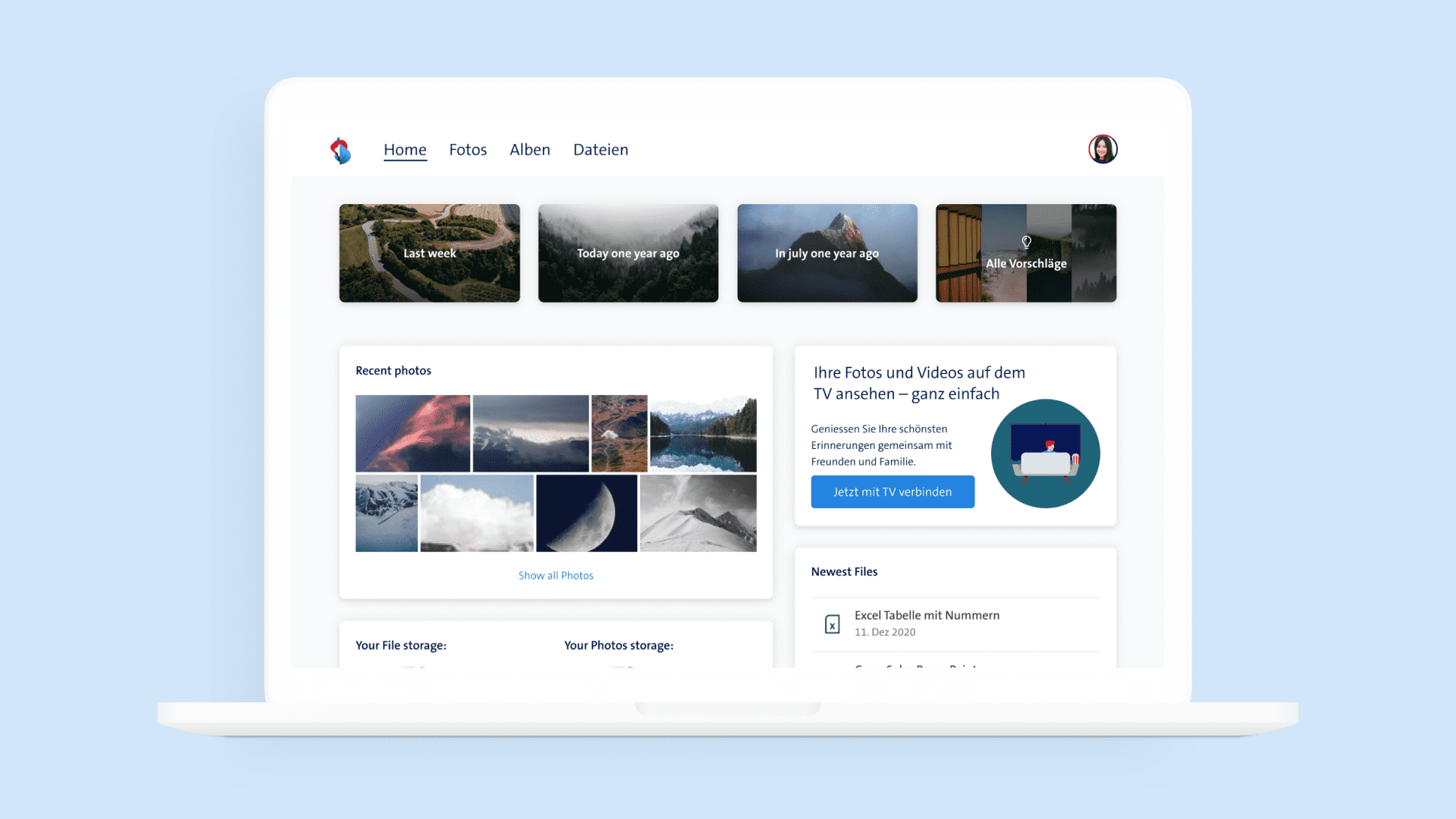
On the Web-App myCloud has a «Homescreen» it serves as a hub from where the user should get quick access to some specific areas within myCloud, that would otherwise cost some time and effort to find. Since the current Homescreen is very static I came up with a concept to display different components on the users homescreen that also serves us to quickly add or remove components from our users homescreen.
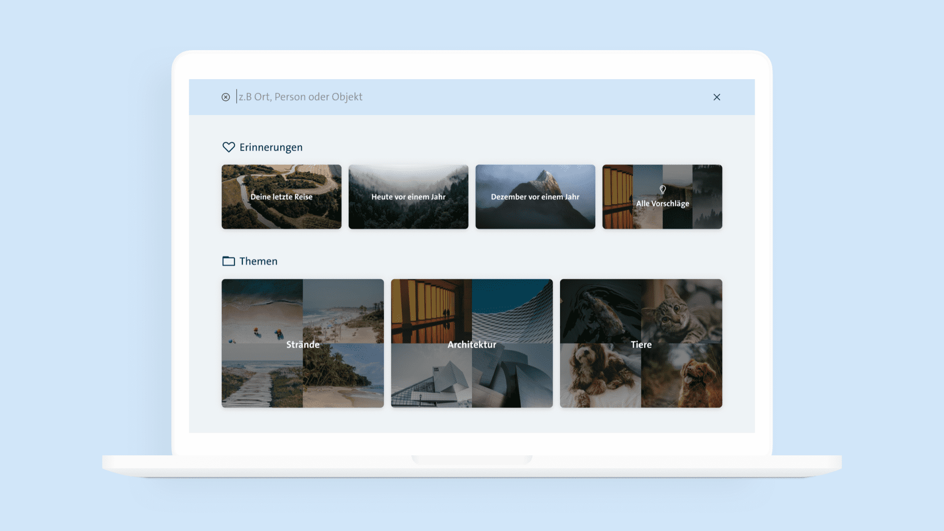
One of the highest requested features in myCloud is to search more specific for what is on the pictures. To sell this concept I've visualised my Idea of how a new empty search screen could look like. It should provide inspiration and guideance for what the user can search for.